A Data-Driven CRO Guide: How D2C Brands Can Boost Conversions (2026 Edition)
Most scaling D2C brands in 2026 are in a similar situation. Paid traffic from Meta and TikTok is still working, but it is getting more expensive every quarter, especially in competitive EU markets like the UK and Germany. At the same time, conversion rates stay flat, creating a widening gap between traffic growth and net profit.
We often see the same pattern across beauty, fashion, and lifestyle brands. Users arrive, browse multiple product pages, but bounce before reaching checkout. Mobile traffic is usually the weakest link, where conversion is significantly lower than desktop. This is not an acquisition problem; it is a product experience problem inside a “leaky bucket” funnel where up to 98% of high-intent traffic is lost.
For a more granular look at behavioral funnels, read our complete D2C CRO framework.
Why common CRO advice fails in real D2C environments
Most CRO advice is built around isolated tactics rather than system-level behavior. Teams are told to change buttons, add generic urgency messages, or run random A/B tests without understanding how users actually make decisions. In real D2C environments, this approach breaks down. Large brands can tolerate friction because of strong brand equity — smaller and growing brands cannot. Typical systemic issues include:
Optimizing UI elements
without analyzing the deeper behavioral context
Running A/B tests
without enough traffic or statistical significance
Relying on desktop-first previews
on MacBooks while 90% of customers are on 6-inch mobile screens
Ignoring dynamic user intent
driven by 2026 AI search agents, resulting in generic landing pages
CRO as a system of friction, not experiments
Our methodology treats CRO as a structured system that manages friction across five conversion layers: Traffic (arrival), Understanding (decoding the product), Trust(believing the offer), Decision (accepting the price), and Transaction (payment).
To quantify this, we use the core conversion science formula:
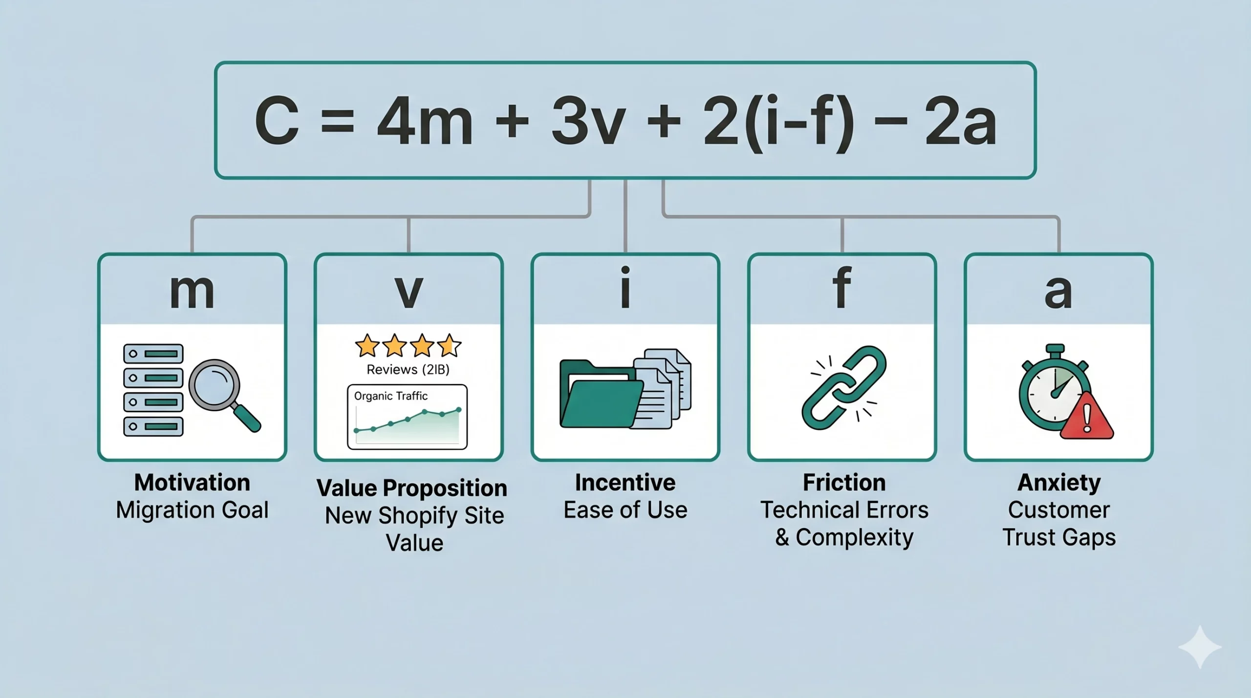
Before running experiments, we reduce noise by auditing behavioral data in GA4, mapping friction via session recordings, and grouping hypotheses based on actual revenue impact.
The anatomy of a high-converting D2C product page (PDP)
The Product Detail Page is where the sale is won or lost. In 2026, a high-performing PDP is defined by how fast it helps users understand value and reduce uncertainty. It is no longer enough to present product information clearly. The real challenge is sequencing that information in a way that aligns with how users make decisions under time pressure, especially on mobile. Every extra moment of hesitation increases the likelihood of abandonment, making clarity and structure the primary conversion drivers.
Reducing cognitive load in mobile UX
Mobile PDPs are often overloaded with unstructured information. Users are forced to scroll and interpret content manually, which increases cognitive load and drops add-to-cart rates. This is not a content problem — it is a decision architecture problem. When every element competes for attention, users are left to build their own mental model of the product, which slows down purchase intent and increases drop-off.
What works better in practice is progressive disclosure:
Clear value proposition
and visual trust markers placed strictly above the fold
A Sticky Add-to-Cart (ATC) button
that follows the user as they scroll through reviews
Fast access to shipping, return policies, or ingredients
without deep page scrolling
Leveraging AI personalization for decision clarity
Effective AI personalization should reduce uncertainty, not increase options. D2C brands scale conversion by dynamically showing delivery time estimation based on user location, tailoring bundle suggestions based on cart behavior, or pre-selecting a “Subscribe & Save” toggle for repeat customers while keeping a “One-time Purchase” default for new users.
3 psychological triggers that drive action
Conversion behavior is driven less by interface elements and more by how users perceive risk, certainty, and effort at the exact moment of decision. On high-performing D2C product pages, three psychological triggers consistently shape whether users hesitate or convert.
Social proof engineering
Social proof is not effective when it is generic or detached from the decision point. Its impact increases significantly when it is embedded directly into the moment of uncertainty. Contextual UGC, micro-reviews, and real usage signals should appear exactly where hesitation happens — not in a separate section below the fold. For example, placing short, specific reviews near the ATC area reduces perceived risk at the final decision stage. The key is relevance over volume: users don’t need more reviews, they need the right proof at the right moment.
Risk reversal clarity
Most conversion loss happens not because users don’t like the product, but because they are unsure about consequences after purchase. Clear, immediate answers to questions like delivery time, return policy, and shipping conditions reduce this uncertainty. The critical factor here is visibility at decision time. If users need to scroll or search for this information, it loses its psychological effect. When risk reversal is embedded into the purchase zone, it acts as a confidence trigger rather than a support element.
Choice reduction
More options do not equal more conversions. In fact, in most D2C categories — especially beauty, skincare, and fashion — excessive choice increases cognitive load and delays decision-making. High-performing PDPs intentionally reduce variance complexity: fewer product options, simplified bundles, and pre-structured recommendations based on intent signals. The goal is not to eliminate choice entirely, but to remove the need for users to analyze choice. When the system does the filtering, the user only executes the decision.

let's talk
Every store has hidden conversion leaks. We’ll analyze your customer journey, identify the highest-impact opportunities, and create a practical optimization plan tailored to your growth goals.
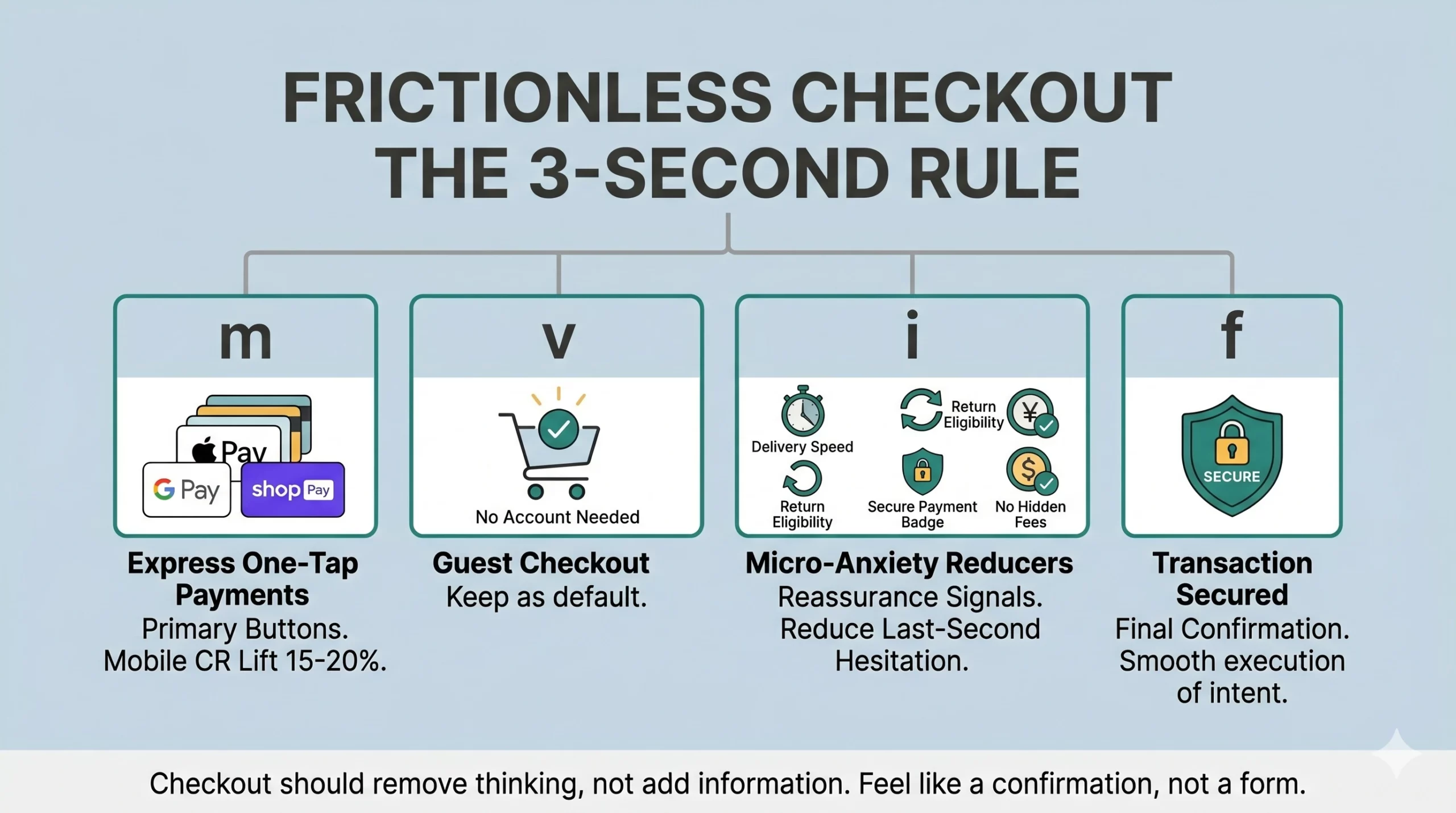
The 3-second rule
Brands regularly lose 30% of their hard-earned revenue at the very last step due to mandatory account creation, complex forms, or CAPTCHAs. This is not a UX issue in isolation — it is a momentum break. At checkout, users are no longer exploring; they are executing intent. Any additional cognitive or physical effort directly translates into drop-off.
The URich checkout standard requires Express One-Tap Payments (Apple Pay, Google Pay, Shop Pay) as the most prominent buttons, which typically lifts mobile CR by 15–20%. Additionally, keeping Guest Checkout as the default and placing micro-anxiety reducers right above the final payment button secures the transaction. These micro-anxiety reducers are not promotional elements — they are reassurance signals. Simple confirmations like delivery speed, return eligibility, secure payment badges, and “no hidden fees” messaging reduce last-second hesitation without introducing distraction.
The core principle is simple: at the moment of payment, the system should remove thinking, not add information. The best checkout flow feels less like a form and more like a confirmation step.
Testing without millions of visitors — micro-conversion tracking
A common misconception is that meaningful optimization requires massive traffic volumes. If a brand has fewer than ~5,000 monthly sessions, traditional A/B testing produces statistical noise. In such cases, qualitative UX research is more effective.
For brands with 10k–30k sessions, the key is tracking intermediate micro-conversions instead of final purchases:
- Scroll depth to key product value sections
- Product variant selection rates
- The time gap between landing and adding to cart
- Checkout entry versus checkout completion rates
To prioritize these fixes without exhausting development resources, we use the ICE Framework, ranking every test from 1 to 10 based on Impact, Confidence, and Ease.
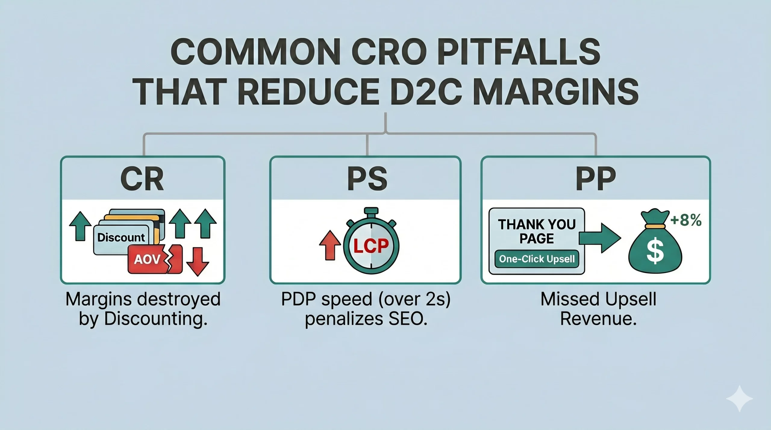
Common CRO pitfalls that reduce D2C margins
Over-optimizing for CR at the expense of AOV
Increasing conversion rates through heavy discounting that destroys your overall Average Order Value and margins.
Ignoring page speed (LCP)
If your PDP takes more than 2 seconds to load on a 5G connection, you are penalized by both Google and user attention
Neglecting the post-purchase funnel
Failing to implement a “One-Click Upsell” on your Thank You page, which can easily increase Revenue Per Visitor (RPV) by 5–8% with zero additional CAC
scaling is not about more traffic, but less friction
In 2026, CRO is the ultimate marketing arbitrage. When your competitors are struggling with rising CPMs, fixing your mobile checkout allows you to convert at 4% instead of 2%, meaning you can afford to pay twice as much for a ad click while remaining highly profitable. But the real advantage is not just efficiency — it is compounding. Every friction removed from the user journey increases the value of all existing traffic: paid, organic, and returning users. Unlike acquisition, which resets every month, conversion optimization improves the performance of your entire system permanently.
Most D2C brands still treat CRO as a set of isolated experiments. High-performing brands treat it as infrastructure — a continuous reduction of cognitive load, decision friction, and checkout resistance across the entire funnel. At scale, this shifts the growth equation. You are no longer forced to buy more attention. You extract more value from the attention you already have and that is where sustainable growth actually happens.
The 2026 CRO Action Plan
The URich 4-Week Sprint:
Week 1 (The Data Audit)
Install a session recorder (Clarity/Hotjar), filter for “Mobile + Bounced,” and watch 50 sessions to pinpoint where users get frustrated.
Week 2 (The Low-Hanging Fruit)
Implement Express Checkout buttons and move your primary social proof above the fold on your top 3 selling PDPs.
Week 3 (Micro-Testing)
Run one simple A/B test via the ICE framework—test a headline change or a different hero image, tracking the Add-to-Cart rate.
Week 4 (Post-Purchase Optimization)
Add a single post-purchase upsell to your Thank You page to instantly boost your store’s LTV.
faq
CRO (Conversion Rate Optimization) improves how effectively your store turns traffic into purchases by reducing friction across PDPs, checkout, and mobile UX.
Because acquisition costs are rising across Meta, TikTok, and Google. Improving conversion from 2% to 4% allows brands to double revenue without increasing ad spend.
Focusing on isolated UI tweaks instead of system-level behavior, which leads to surface improvements without fixing real funnel friction.
Mobile product pages (PDPs) and checkout flows, where cognitive load, trust, and payment friction directly determine purchase decisions.
Use qualitative data and micro-conversions like add-to-cart rate, scroll depth, and checkout initiation instead of relying only on statistical A/B testing.


 3")