

EdTech & LMS Platform Development: Scalable Learning Solution
A conversion-focused landing page for an educational platform designed to turn course interest into enrollment through clarity and interactive UX

THE CLIENT
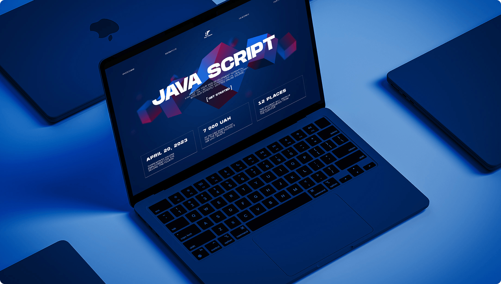
Bear Classes is an online education platform offering structured courses through a modern, digital-first experience.
The goal was to design a landing page that not only presents courses but actively drives user engagement and enrollment
PROBLEM SPACE

Low Engagement in Education UX
Most online course platforms feel static and скучні — users scroll but don’t convert
Abstract Value of Courses
Courses are intangible — users need to quickly understand what they get and why it matters
Overloaded Content
Educational platforms often try to say everything at once, creating cognitive overload
Weak Conversion Flow
Without clear structure, users hesitate instead of enrolling
WHAT WE DID
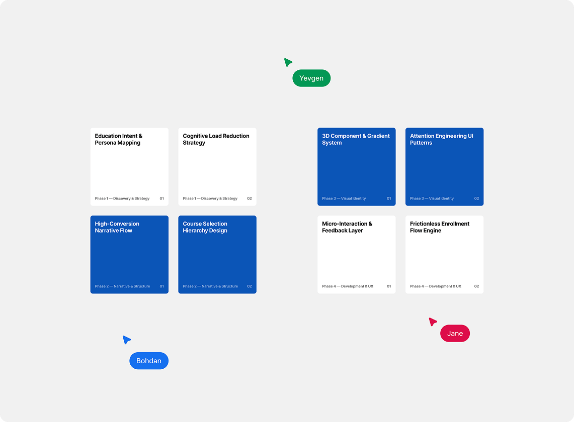
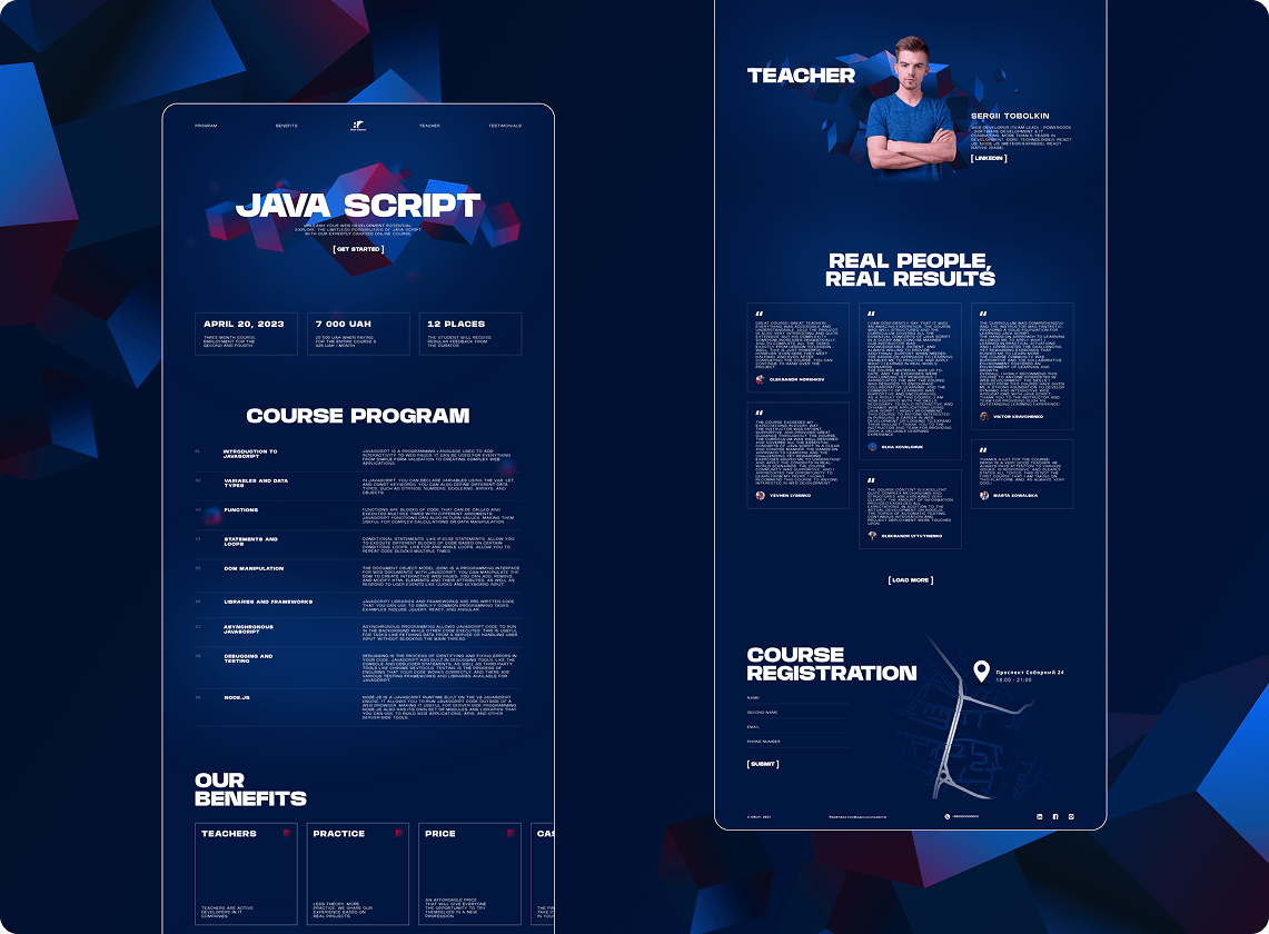
Conversion-Focused Landing Structure
Built a clear narrative flow: value → courses → benefits → action so that the user can navigate without any 'freezes'
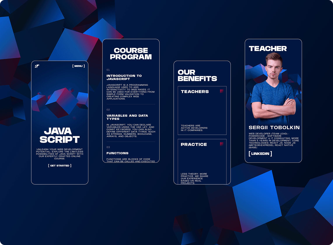
3D Visual Language
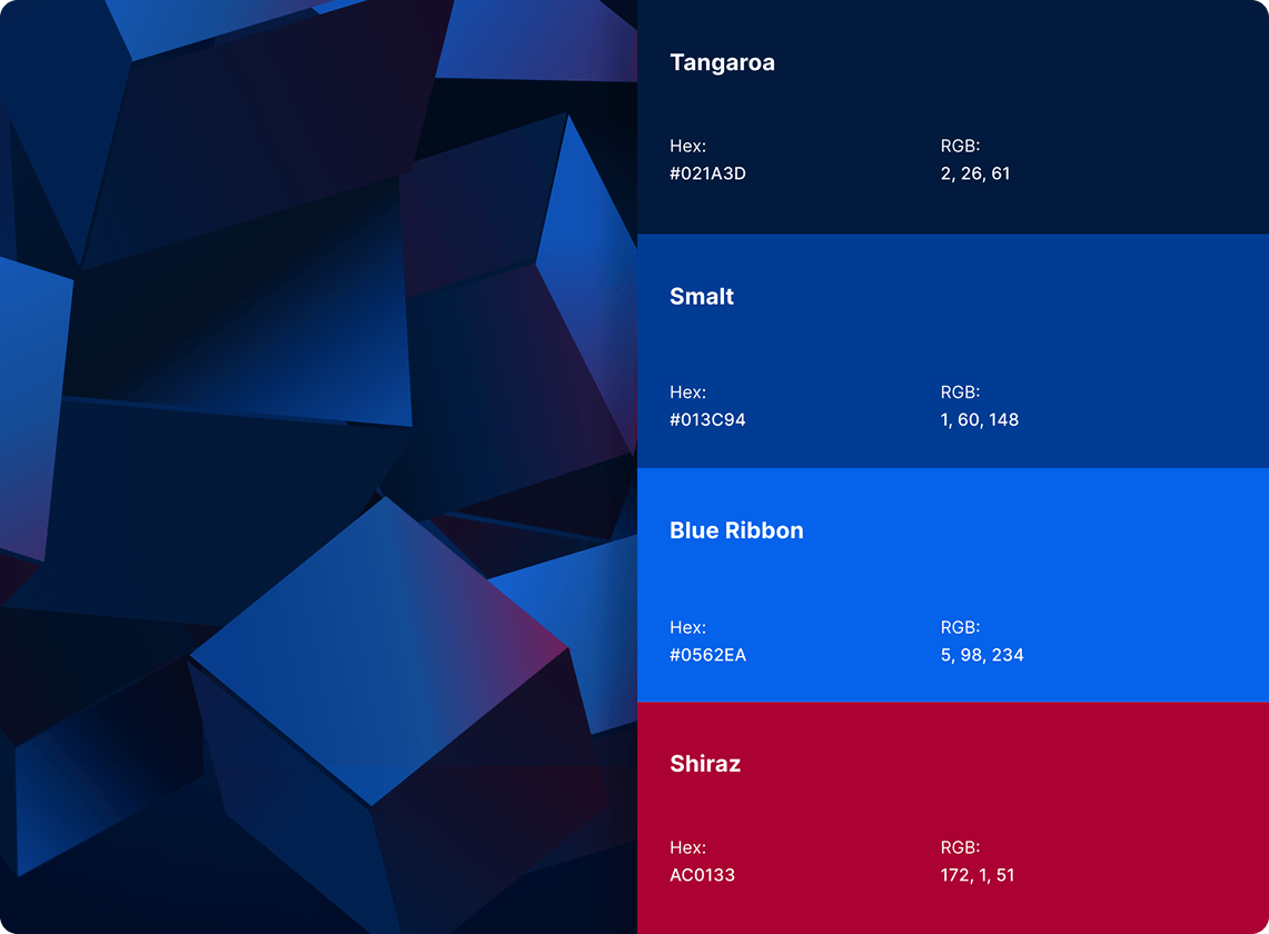
Introduced modern 3D elements and gradients to create depth and stand out from typical EdTech platforms
Course Presentation System
Structured course blocks for quick scanning — so users can compare and choose without
Interactive Feedback Layer
Added user interaction elements that allow quick questions or actions — reducing friction before enrollment
TECHNICAL IMPLEMENTATION
Defined key user intent:
“I want to get a quick overview of the course and sign up.”
Prioritized only critical content — eliminating noise typical for education websites
Built a consistent design language with gradients, 3D elements, and clean typography
Implemented smooth transitions and interactive components to enhance engagement

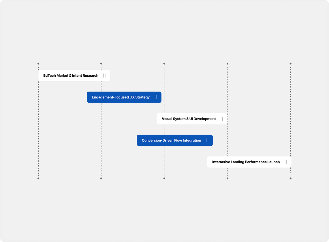
WORKING PROCESS
We treated the project not as a multi-page platform, but as a conversion-focused entry point
Visual elements (gradients, 3D shapes) are not decoration — they guide user focus
We reduced content instead of expanding it — making decisions faster
Small interactive details increase perceived product quality and trust
Every block answers: why should the user enroll right now?
PROJECT RESULTS

A visually distinctive landing page that stands out in the EdTech space
Clear course structure → faster understanding and decision-making
Improved engagement through interactive and dynamic UI
Reduced friction in the enrollment process
A scalable landing framework for future courses and programs
TOOLS WE USE
Design
-
 Figma
Figma
Development
-
JavaScript
-
HTML5
-
CSS3




Scalable Shopify Store for Global Home Decor Sales